Dollar Tree BFA Project / Branding

Changing the tone of Dollar Tree’s brand from cheap things to affordable essentials.

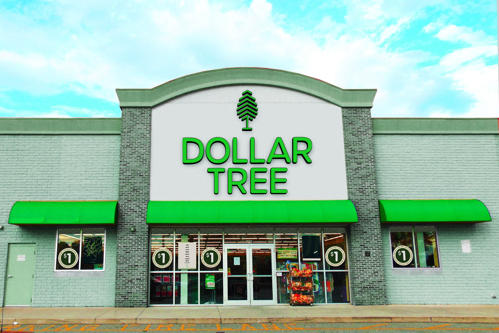
Logo
Brand recognition is important for Dollar Tree, their logo has always had a tree with the number one as the trunk of the tree. These are my renditions of that logomark. I wanted to soften up the edges and declutter the current logo. On top of that, the new logomark needs to be even and consistent in terms of stroke weight and spacing.
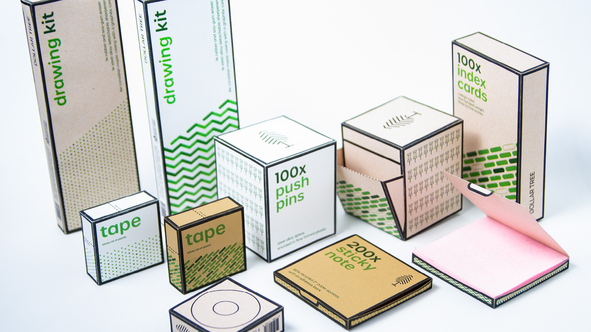
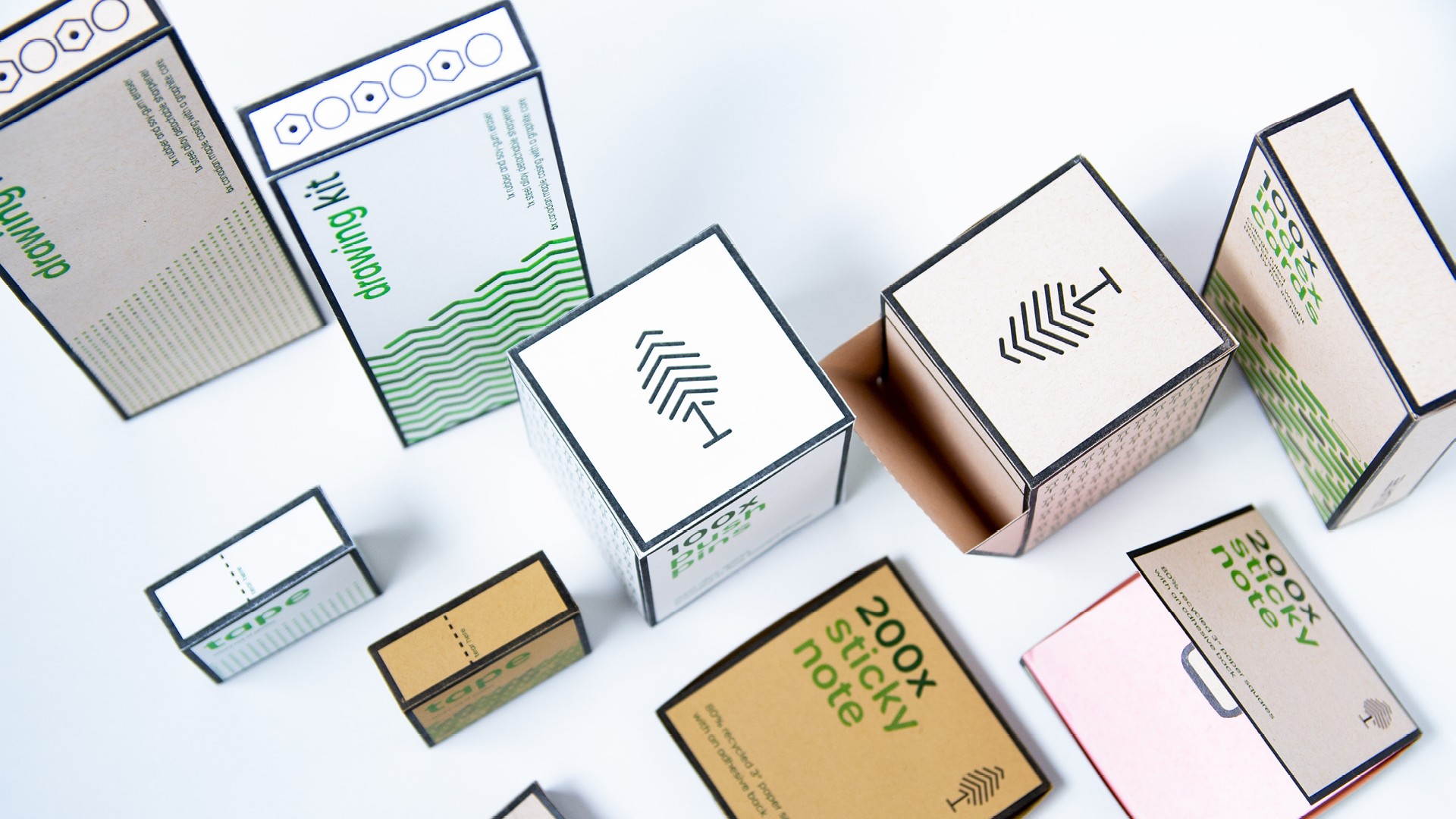
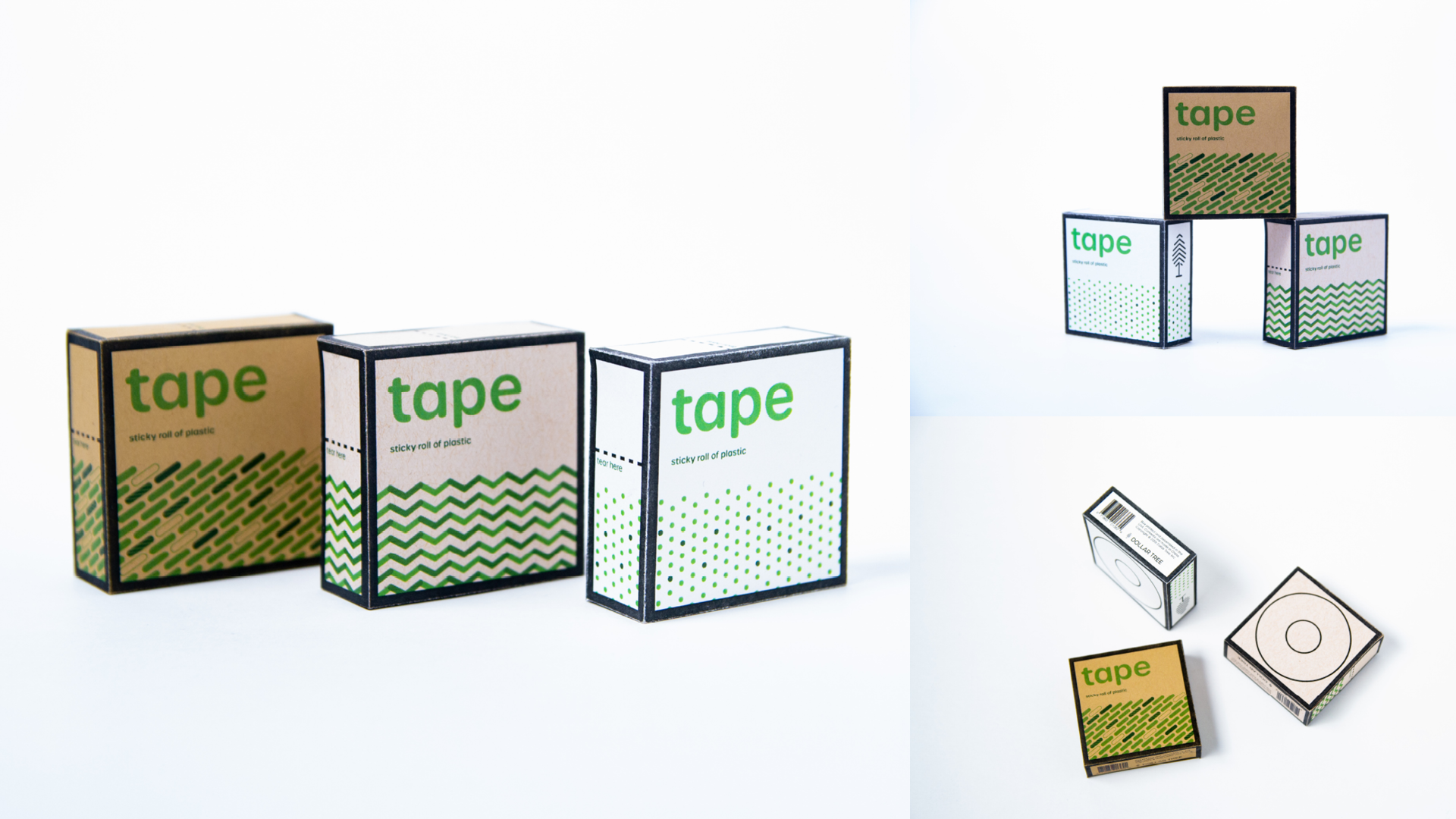
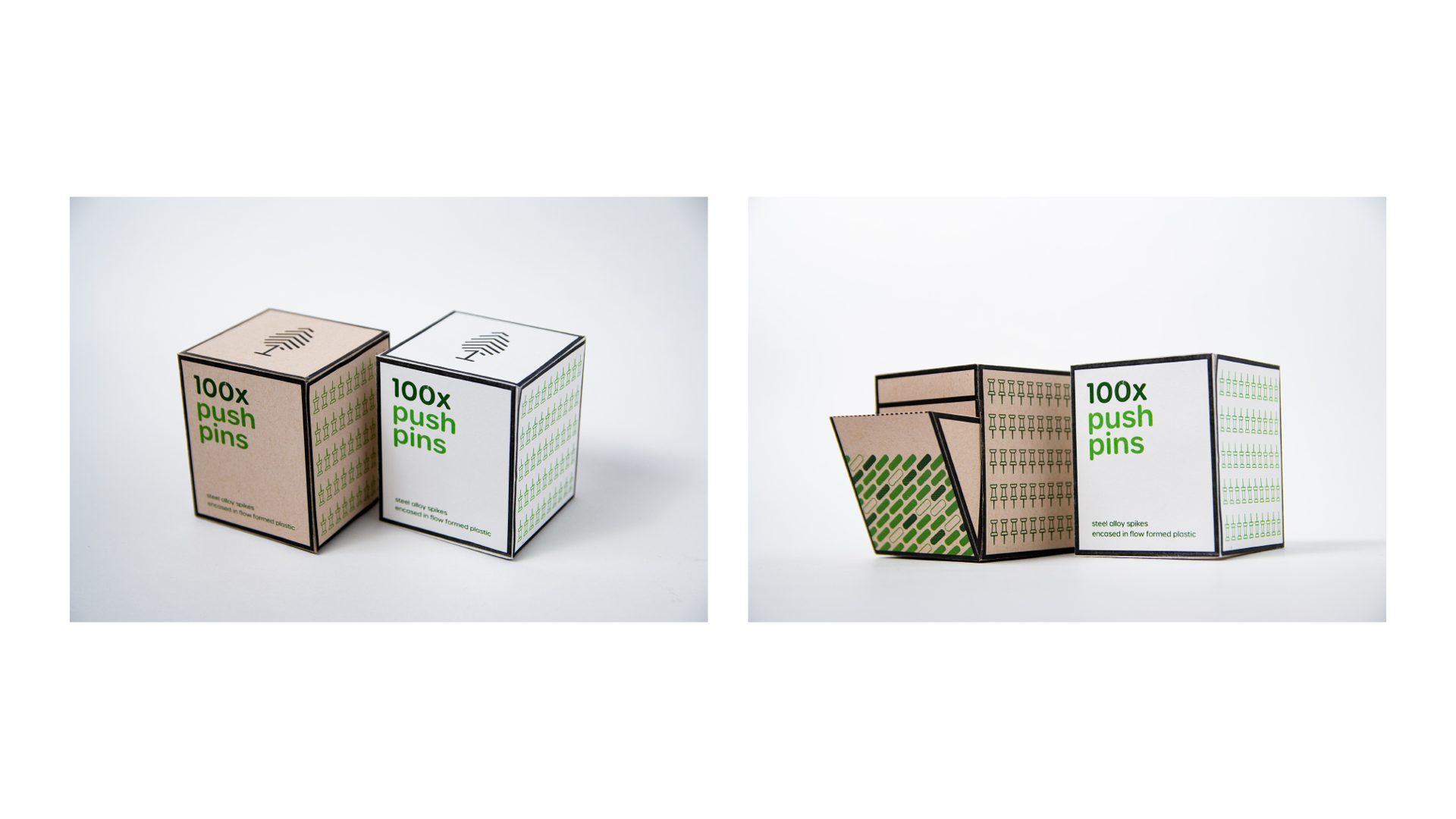
Packaging
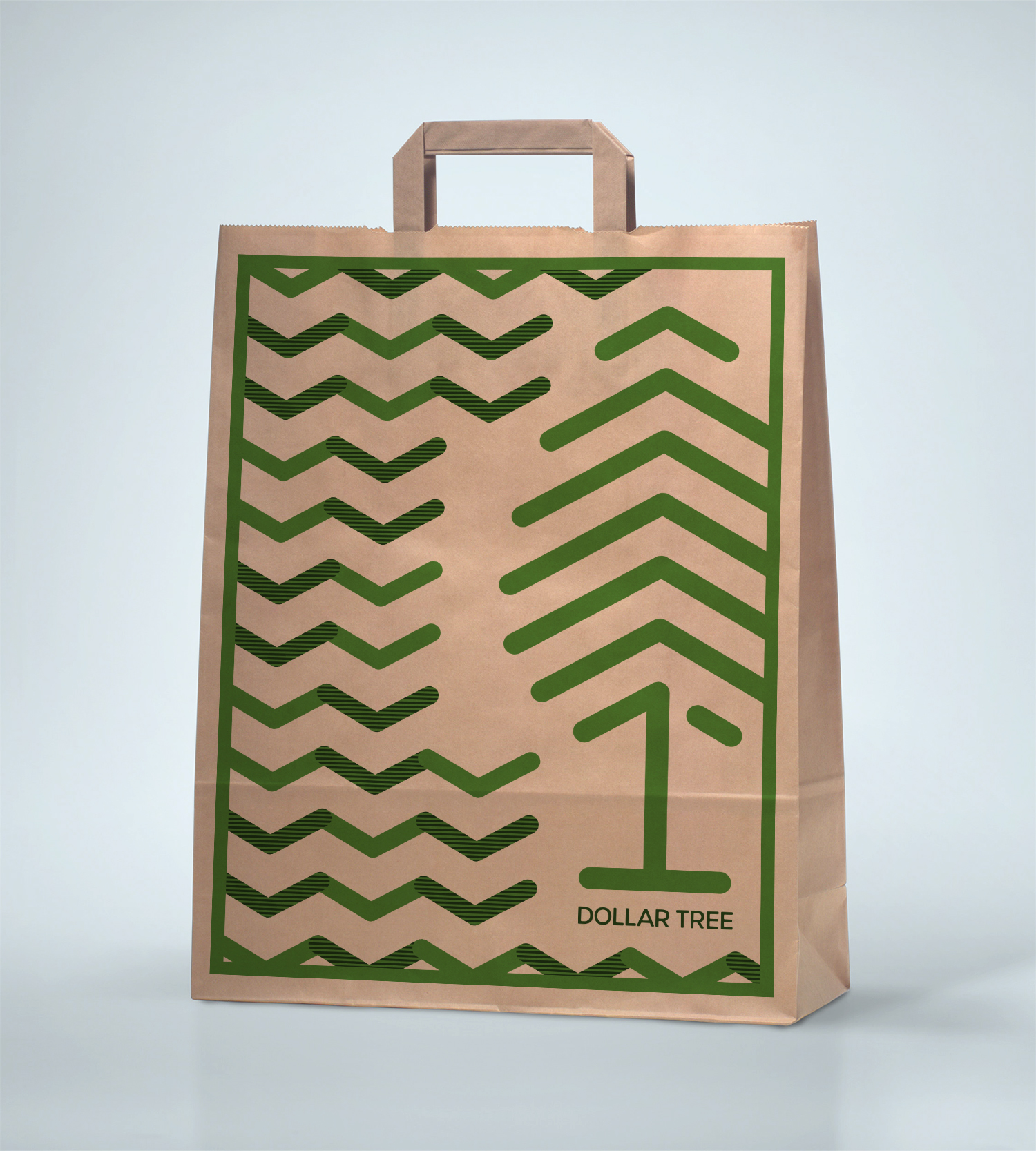
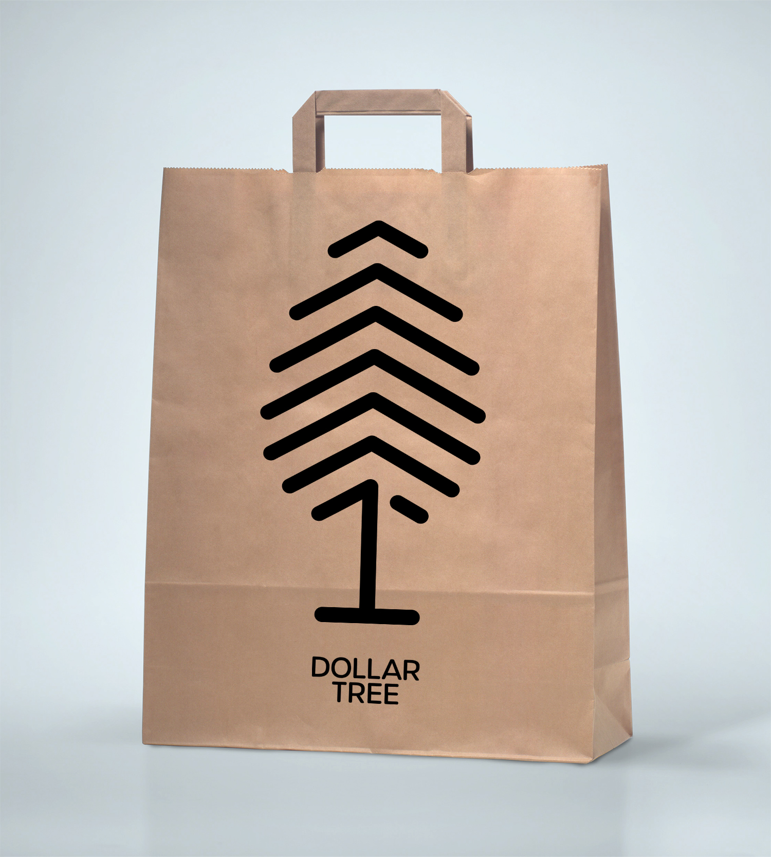
To increase the visual appeal and value of Dollar Tree, the packaging was revamped to have a similar visual language and as an extra bonus, make it fully recyclable in contrast to the current plastic and paper packaging.
I looked for ways to have the packaging have a second purpose. For example, the pencil packaging has a sharpener built in and the box itself becomes a container for all the shavings.


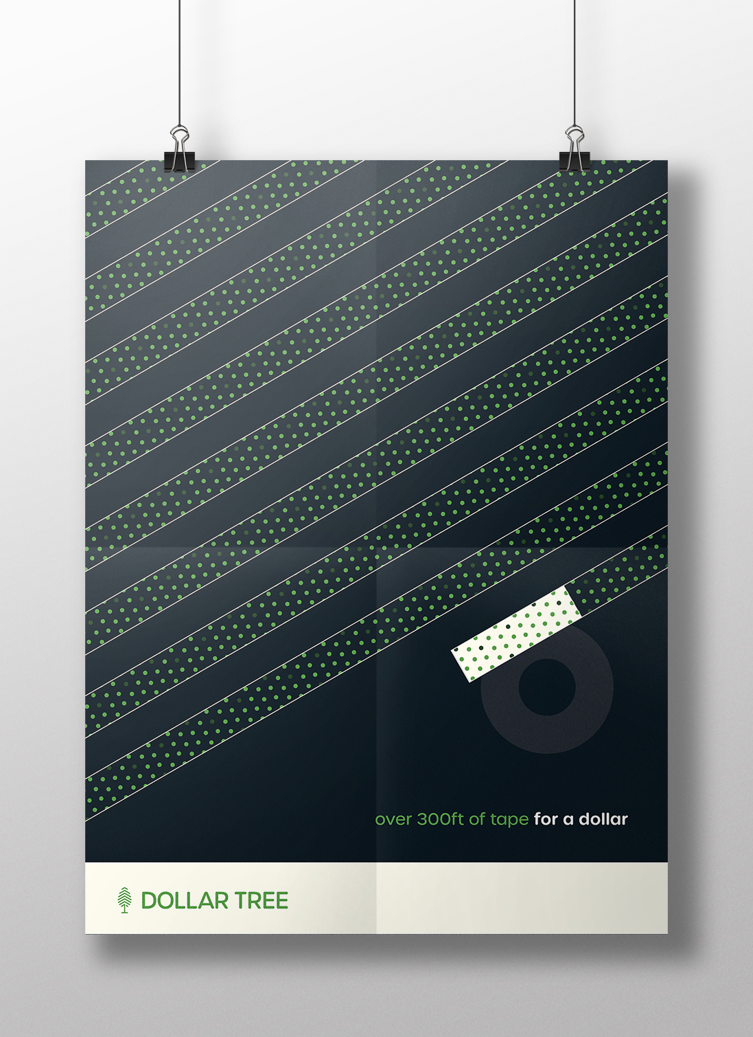
Advertising
To support the new brand, promotional material was made alongside it. Dollar Tree’s new campaign is “__________ for a dollar”, further emphasizing that they have everything for a low price of a dollar.


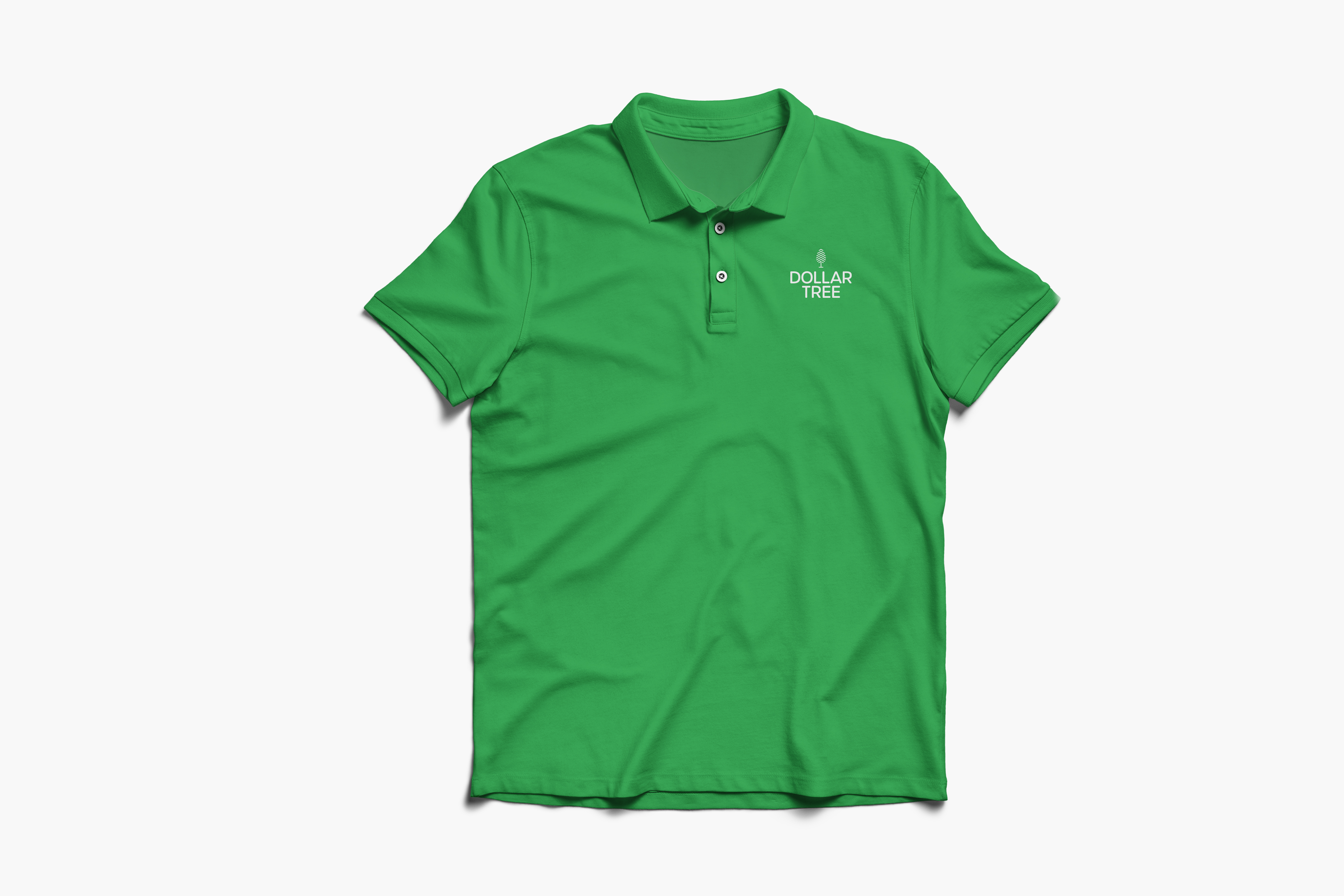
Additional Assets